Trends in bus graphics
September 13, 2017
Linda Johnston, national account manager at Aura, has worked with bus and coach operators, manufacturers and livery design houses across the UK for many years. Using her extensive experience she advises on the technical and creative use of self-adhesive and printed graphics on passenger vehicles, helping clients manage large livery projects and one-off promotional campaigns. Over that time she has seen a lot of change and understands both the operation requirements and customer demands on the sector.
What are the current trends in livery and graphic design for buses and coaches?
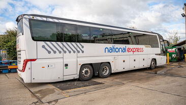
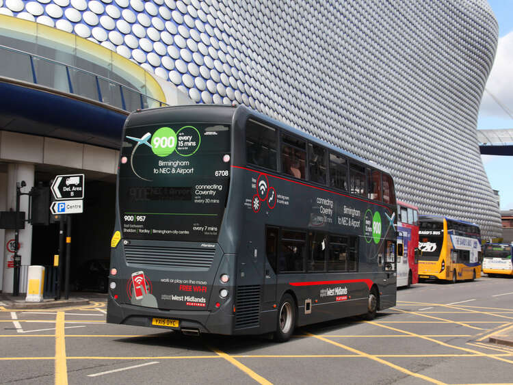
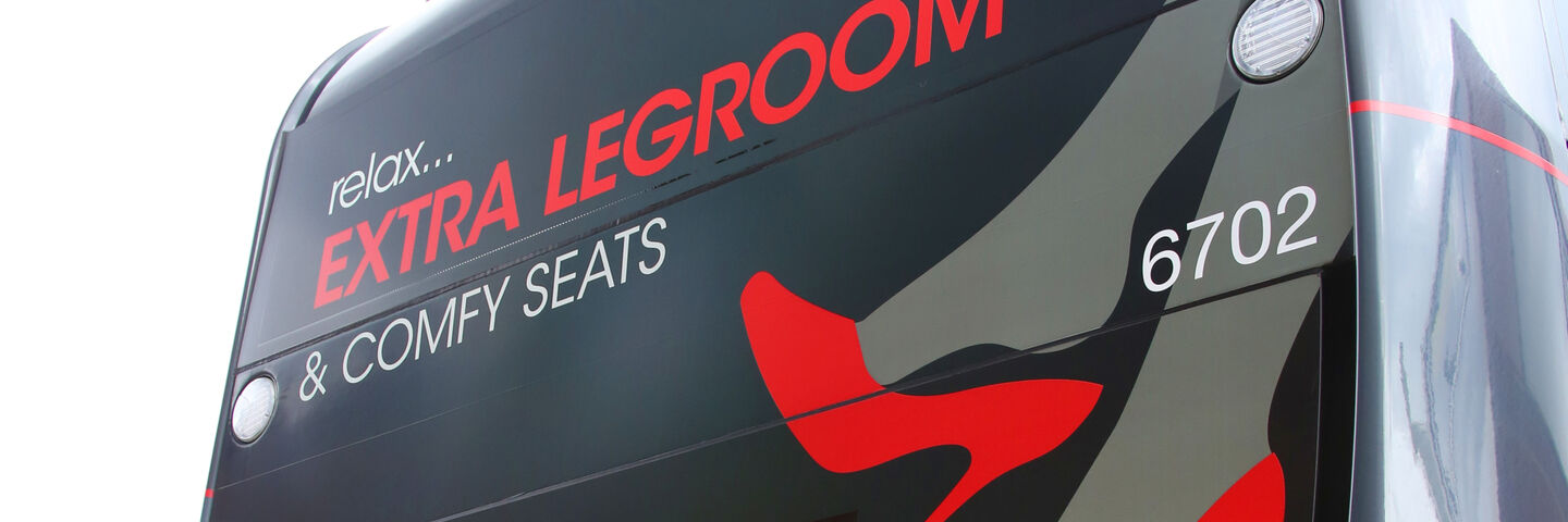
Using a combination of paint and graphics has long been the tradition in the bus and coach sector and for many corporate branding programmes this remains the case. However, development of material and print technologies in the graphics sector has realised an increase in the use of graphics and full colour designs for promotional marketing activities. One trend that continues to grow is a more targeted approach to bus and coach branding that focusses on the overall service experience and tries to connect with customers. There is a definite move to use livery to distinguish between different levels of service and on-board facilities especially with new premium offerings. As the passenger transportation market remains very competitive this is a strategy we are sure will continue to increase.
What is proving most popular: painted or vinyl graphics? Or something else?
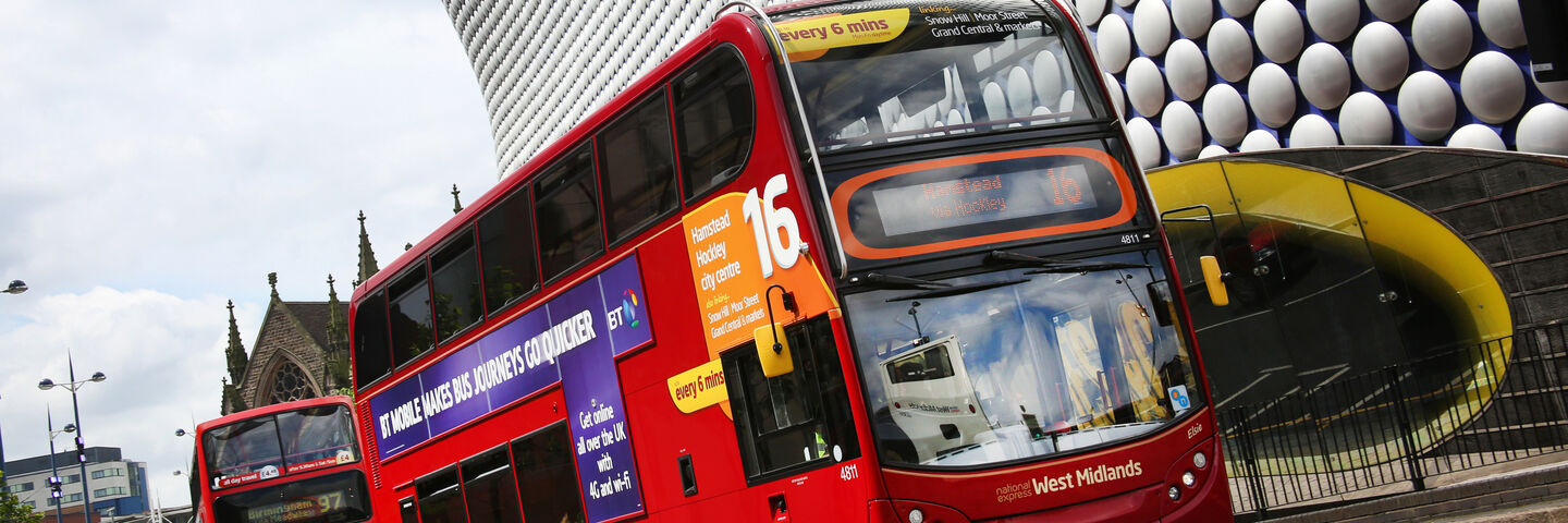
A combination of paint and graphics remains the most popular format for corporate branding programmes as it provides companies the ability to promote corporate colours and branding in an effective way. With marketing or promotional activity the trend is more for full colour printed graphics as this allows huge variety in the creative and finished effect.
Why do you think this is?
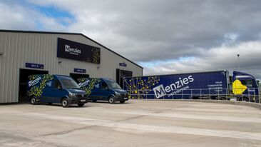
For corporate branding, many buses or coaches will be painted to the company colour way as part of the vehicle build with the graphics then applied on top to create the finished look. Printed graphics can more easily cater for specific route branding and identification and other promotional messaging that paint is unable to. It gives the option to be able to change this when required with relative ease and cost effectiveness. This is a tried and tested method for achieving corporate branding, one that works for operators and they trust it. That is not to say that you could not use full vinyl wraps to achieve the same, but that approach is more common with short-term campaigns and one-off liveries. The use of graphics for marketing or promotional campaigns is now standard practice and the very nature of the print process means marketing teams and advertisers can be very creative with the design while still achieving stable costs.
What are the most advanced designs you can do? And what makes them advanced?
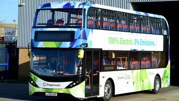
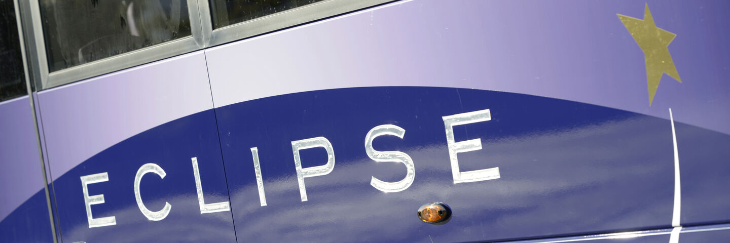
Full colour printed wrapping of the bus or coach is the most advanced way to brand a vehicle as the process allows for endless opportunities for design and creates a significant impact with the customer. Advancements in material and print technology means we can now completely wrap the bus or coach and provide a 5 year warranty, making it more suitable for corporate branding as well as promotional advertising. Of course there is also a huge range of specialist films with different colour options, particularly metallics that allow for intricate cut shapes to be overlaid on paint or full wrap designs, these can be very cost effective compared to paint applications of a similar nature. One factor often overlooked though is ensuring the design allows for compliance elements such as safety labels and legal lettering, but we work with each customer to ensure this is taken into account on the final design.
How is livery and bus and coach graphic design changing? And what do you think people will be doing in the future with their livery and vehicle graphics?
Branding of buses and coaches should not be seen as simply an external application and we are seeing an increasing trend with companies incorporating interior branding into overall strategy.
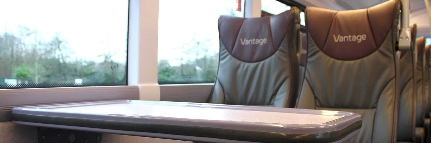
Factors such as seats, interior panels and flooring are all now an intrinsic part of the brand experience for customers with graphics also being increasingly used in the interior space to promote brand values.
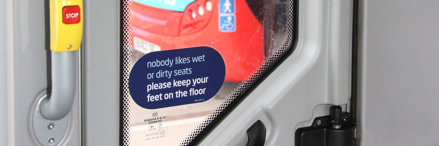
Another advancement we are seeing is a change of tone with labels and signage for the interior of the vehicle. Traditionally these items have been statements of restriction, telling the customer what not to do, but we are now seeing a very welcome change with these messages now focussing on the action required rather that to be avoided. It’s a simple change, but one we believe really enhances the customer experience. This can be something as simple as “Do Not Litter” being changed to “Please place rubbish in bins provided”.
