4 Proven Ways That Architectural Branding Adds Value to Your Business
August 23, 2022
Construction and the built environment go hand-in-hand, but when it comes to brand identity, there are other factors at play than just the physical structure of your building. When implemented correctly, specific design and branding elements work to truly amplify your company’s vision.
We’ve produced many case studies covering some of the architectural branding we’ve completed for customers and how it has increased the value of their business premises.
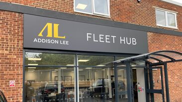
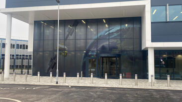
Our case studies about Airbus and Addison Lee demonstrate the profound impact cohesive branding can have on both your employees and customers.
But what are the key ways you can achieve this impact too? Let’s get into the fundamentals of how you can add value to your space.
1. Involve your customers and employees
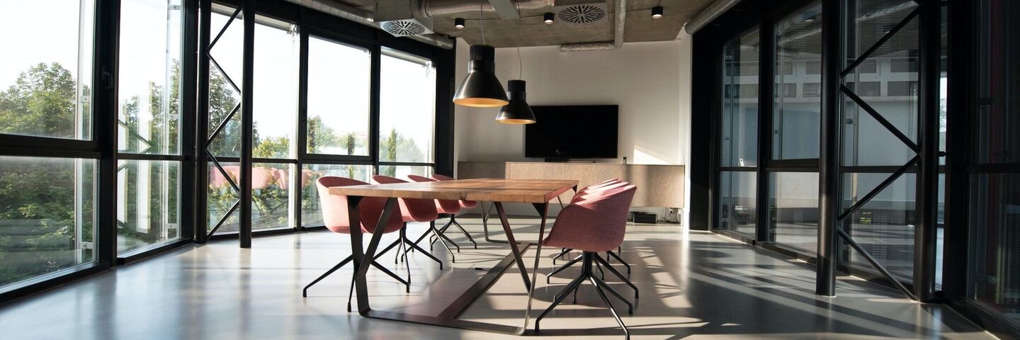
Taking the opportunity to integrate branding into your workspace or public-facing premises is a decision you won’t regret. It creates an immersive brand experience that makes employees feel like they’re part of the brand and contributes to their wellbeing.
This instils a sense of pride and purpose, leading to increased productivity and quality. You also need to promote trust and loyalty in customers, which can be achieved with cohesive, professional branding. By displaying this level of pride in your appearance, you instantly increase credibility.
It’s also important to develop and understand your buyer personas when designing your space to ensure you’re providing value to your target market. Draw your customers in by aligning your brand with their needs and making your marketing efforts customer-centric.
Stand-out, personalised branding creates buyer aspirations and favourably affects customer perception and purchasing behaviour.
2. Use impactful branding elements
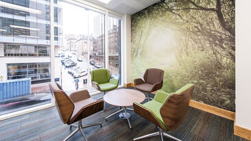
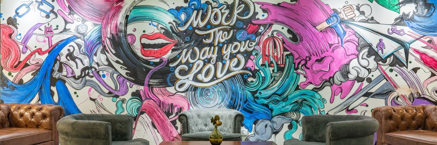
Having unique wall wrap murals created by a professional designer that convey who you are as a business will immerse visitors in your brand. A simple solution that makes a huge difference!
Aura are experts at transforming unremarkable blank walls into striking features, using your brand’s colour palette, themes from your business, and your origins.
Are your touchpoints looking tired? DI-NOC is not only a more cost-effective and sustainable solution, but it also takes any environment from bland to looking brand new. Saving you money by refurbishing your existing touchpoints rather than replacing them.
As a highly versatile material that can be easily incorporated into your spaces, DI-NOC locks all your branding together. Use it on almost any surface, from windowsills, doors and countertops to reception desks – the application potential is endless. This is your sign to makeover those uninspiring, dull surfaces with styles that represent your brand!
3. Create engaging environments
Exterior environment
You aim to design a space that creates an experience and makes your brand tangible. But how do you do this?
Your exterior brand assets and wayfinding signage are arguably the most important place to start when it comes to architectural branding – this is where first impressions are created.
What makes your exteriors more appealing? Well-placed signage and promotional activity are essential as they catch the attention of passers-by, reinforce brand recognition, and can be instrumental at the beginning of the buyer journey. If you’re going all out, building wraps and hoarding work wonders to make your business premises stand out.
Interior environment
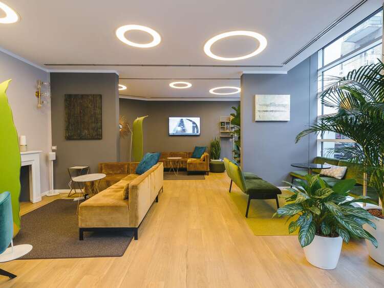
Now that people are inside your premises, you want to continue to impress them. This is your opportunity to reinforce your brand identity by visually communicating your core values and company vision. You don’t want to contradict the image that your exterior environment portrays!
Branding elements such as carpet graphics, window manifestations, and feature walls can unify a space when seamlessly integrated by an expert. At Aura, we conduct site audits highlighting key areas that would benefit from branding and which elements add the most value - so you don’t have to do any guesswork.
4. Add some visual flair
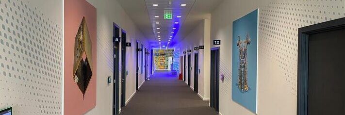
Now we’ve covered the main aesthetics of architectural branding, it’s time to add the finishing touches. We’re talking wayfinding signage, door signs, tension fabric systems, digital posters, interactive screens, moss walls, and more.
But why do these elements matter so much? Well, you need to maintain the great first impression you’ve made so far. If your business premises is hard to navigate or creates confusion, it won’t reflect well on your company. It’s all part of creating an outstanding experience for everyone who walks through your door.

Directional signage is essential but is often an overlooked aspect of architectural branding, so don’t make the same mistake. It amplifies your brand and lets your visitors see you’re an efficient organisation that pays attention to detail.
Would sharing videos, ads, and messages you can instantly change at the touch of a button help your business? If the answer is yes, then digital posters and interactive screens could add another dimension to your space and elevate your branding above your competition. Moving imagery captures attention, allowing you to tailor and instantly change display information wirelessly. What’s not to love?
And here’s something you may not have considered: adding plants and greenery to your interiors has a proven track record of improving oxygen quality and wellbeing. A relatively new addition to Aura’s branding repertoire is moss walls, which can be customised with your branded company name, logo or word of choice.
Investing in your environment with architectural branding adds value in various ways. It not only makes your premises inviting but also shows visitors who you are, conveys your values, provides a memorable experience, and creates a tangible brand identity.
Ready to get started on transforming your space? Get in touch to see how we can help you pull everything together. We are architectural branding experts with decades of experience in helping others bring their brands to life!
