Cost effectively breathing new life into care home interiors
Many care facilities are located in buildings that are often full of character but are outdated or in need of a serious facelift. With limited budgets and patient care the main priority it can be a challenge for managers to keep things looking bright and modern for residents and their visitors.
Two such care homes were recently looking to refurbish elements of their facilities and took a new approach to old furniture, fixtures and fittings by working with our versatile interior refurbishment solutions.
Killilea House in Bury is a thirty-six bedroom intermediate care facility with an older wing and a newer extension. In the four bedroom wings the fire doors had become worn over the years as signs were replaced and removed then reattached damaging the veneer on the doors. We also recently worked with Eric Wright Construction applying the same solution to the challenge of converting an old NHS-run building to a private care home in Lancashire.
The end result was two refurbishments that cost a fraction of the budget and with minimal disruption to staff and residents.
Refurbishment, a new approach to old fixtures & fittings
The homes needed to replace a whole range of fixtures and fittings but the cost was prohibitive and the work required extensive with tight timescales.
Our team conducted site visits and made some recommendations based on the brief, as well as full dimensional surveys and templating.
Key Objectives:
- Refurbish all doors in limited time with minimum disruption to the daily running of the home and its residents.
- Modernise the look of the shower rooms, wrapping vanity units
- Update the tired existing toilet block facilities
- Refresh tired looking reception desks, lift interiors and architraves
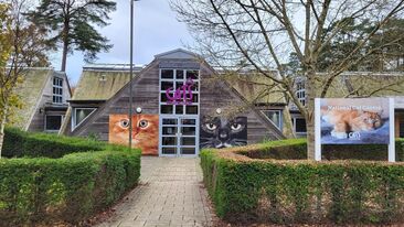
- Bring the outside in with colourful nature based printed wallpaper wraps
Refurbishing rather than replacing enabled us to offer result that were quick, clean and cost effective, whilst also boosting each project's green credentials.
Bright & clean. The look of new without the outlay.
The old fashioned doors were wrapped in vibrant solid, block colours, even the shower panels were re-cladded and then fitted with a digitally printed wrap which modernised the look of the shower area immediately.
Toilet block panels improved the aesthetics at minimal cost and the new digital wall graphics featuring photographs of the locality, helped to create a relaxed and personal environment, less like a hospital and more like a home from home.
Tired looking reception desks, lift interiors and architraves were rapidly refreshed on site, in working hours, without causing any dust or contamination which is present when re-painting.
The materials used were selected from the 3M™ Di-Noc™ material range. This product is great for clean and cost effective surface refurbishment and enhancement projects, where quickly changing the look and feel with minimal disruption to the normal running of the business is key. With over 500 patterns, from wood grains and stone effects to metals and leathers, the Di-Noc range is a versatile and inspiring decorative covering.
The large choice of patterns and colours, in fire-rated material and the option to choose images of local landmarks or scenes, can bring comfort and familiarity to residents enhancing the care environment.


