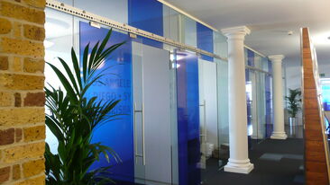
Transforming a new Youth Zone with fun and vibrant graphics
We were recently approached by OnSide Youth Zones to provide design services and a graphics solution for their first London-based purpose-built youth facility opening in Barking – named by the young people as ‘Future’. We have also been asked to provide solutions for their upcoming facilities in Croydon (Legacy) and Barnet (Unitas).
Their Youth Zones operate in predominantly deprived areas for young people from low-income families, and are funded by a group of dedicated partners, fundraisers and investors. They have more than 500k visits per year and are open to young people aged 8-19, and up to 25 for those with disabilities. The young people can use the facility for just 50p per visit and can make use of up to 25 activities, such as; football, climbing, martial arts, dance, music, film & multimedia, arts & crafts and a state-of-the-art fitness gym.
As a sense of community is important in the early development of young people, OnSide were looking to transform their building into a welcoming environment where people could feel comfortable socialising. They asked us to provide graphics for a space in which they could deliver an inspiring range of activities and targeted services that helped young people out of challenging/unsafe situations or social isolation.
The end result was something that everyone was incredibly pleased with, and our solution was not only durable but also incredibly cost effective.
Turning big empty rooms into supportive spaces
The facility was filled with large white spaces that were in need of vibrant graphics and a revamp in order to give OnSide the kind of building their mission deserved. The materials we used needed to be incredibly tough as they were looking for a solution that meant there would be no need for repainting every month after inevitable damage.
After receiving personal mood boards from the young people’s development group that helped design the building, and conducting visits to the site, we determined the best course of action to bring the bare walls to life.
Key Objectives:
- Devise and provide original design work that fits in with the ethos of OnSide and engages with a younger audience.
- Supply full wall graphics to multiple floors of the building that were not only economical but also super durable, given the nature of the physical activities that they would have to endure.
- Use mood boards provided by the young people to create a design for the interiors that transforms the space into something fun, lively, and colourful.
- Give each facility its own identity and incorporate a feeling of inclusion into the overall feel.
A durable answer to a multi-purpose requirement
The original artwork developed by our design team was printed on standard vinyl wraps with a satin overlaminate and installed to cover the giant white walls. There were numerous rooms that needed covering, all with a unique purpose – interview preparation rooms; a kitchen with hot meals; climbing walls; a fitness room; film & multimedia area; skill teaching rooms; etc.
To meet the needs of durability, we used AuraFlex on the bottom half of the walls and all staircases. AuraFlex is a highly scratch/gouge resistant material which is sub-surface printed and extremely durable against kicks, knocks, and scuffs.
AuraFlex outperforms traditional laminates in abrasion resistance, and therefore significantly reduces project costs. By using this material, it meant that OnSide would not have to repaint the walls every 6 weeks, meaning significant cost savings and a cleaner, fresher environment for longer.
The ‘Future’ facility was also incredibly honoured to have been opened officially by the Duke of Sussex, Prince Harry, who is an avid supporter of all the work that OnSide do. We also provided a glass opening plaque to honour his visit and then multiple acrylic wall mounted plaques depicting all the sponsors. The staff, project managers, and young people of OnSide were extremely happy with the outcome and felt that it embodied everything that Future represents.


