Best Rebrands of the 2020s
September 09, 2024
In a world where consumer preferences evolve at the speed of light, staying relevant can be a challenge. Whether it's a complete overhaul or subtle refresh, rebranding can revitalise your company’s image, strengthen customer loyalty, and open new market opportunities. But how do you know if your brand is ready for a transformation?
This decade has witnessed some remarkable rebrands, with companies redefining their identities to stay competitive. From modernising logos to complete overhauls of brand messaging, the following transformations have captured consumer attention and reinvigorated market presence. Let’s explore some standout rebrands and see if they could inspire change for your business.
Kia: From ordinary to extraordinary
Kia’s rebrand initially sparked confusion, with internet users mistaking the new logo for "KN," prompting speculation about a mysterious new car brand. Many online publications labelled it a "total flop,". It’s true that the original logo of “KIA” in the oval was quickly recognisable across the globe, whereas the new one was being misread and causing confusion.
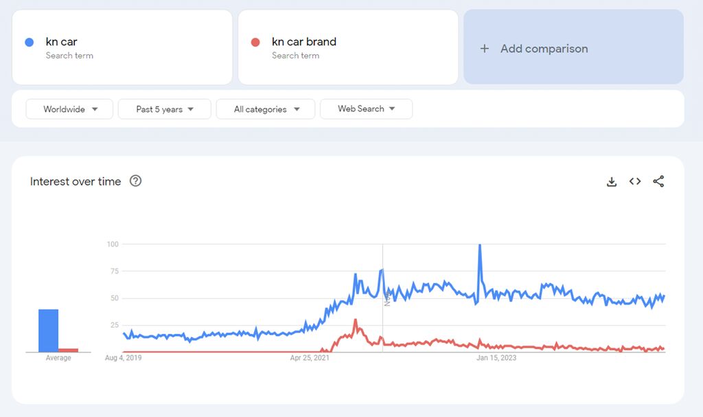
So why do we think this was a great rebrand? Because it gave new life to a drab brand, repositioning it as modern and sophisticated. More than just a new logo, the rebrand was accompanied by a shift in Kia’s design philosophy, as reflected in their new tagline, “Movement that inspires.” This bold change has been instrumental in repositioning Kia at the forefront of the electric vehicle (EV) revolution, with sales of their EVs seeing incredible growth since the rebrand launched in 2021.
If your brand feels disconnected from your target audience, Kia’s example shows that a bold rebrand could be the spark you need to transform your image and stay relevant in a fast-evolving market.
Key takeaways:
- Bold changes can reposition a brand in exciting new markets.
- A logo is part of the story, but brand messaging and philosophy are crucial.
- Successful rebranding can allow you to command a premium price in the market.
Toblerone: Evolution not revolution
While Kia’s bold transformation has propelled them into a new era, Toblerone took a more measured approach, proving that small changes can still have a big impact. Toblerone’s rebrand is a perfect example of putting out a fresh vibe while not upsetting the apple cart with revolutionary changes.
Rather than changing an iconic and much-loved logo, they opted to focus on product design language. The two distinctive, and unique, features of a Toblerone bar are the pyramid shape of the packaging, mirrored by the chocolate segments inside, and the famous Alpine Mountain peak, Matterhorn.
Prompted by Swiss rules barring Toblerone using the Alps iconography in their branding, Toblerone replaced the Matterhorn for a generic mountain symbol and an image of a chocolate segment. Using symbolism to marry together the key distinctions of the brand, turns the product itself into a symbol of the Swiss Alps and its heritage.
Toblerone refreshed its iconic red, serif logo with subtle modern tweaks, while preserving the core colour and typeface to maintain brand recognition. The rebrand also introduced a bespoke "Tobler" typeface, inspired by the brand’s heritage, which now appears across digital platforms alongside a vibrant secondary colour palette to add a modern touch.
If your brand is already well-established, sometimes minor adjustments are all you need to keep things fresh without alienating loyal customers.
Key Takeaways:
- Subtle updates can modernize a brand while preserving its heritage.
- Regulations or external factors can inspire creative design solutions.
- Keeping core elements like colour and typography ensures brand continuity.

Pepsi: Retro meets modern
Pepsi knows they have an iconic brand, so they know when they make even a slight change, the outcry will reverberate throughout the stratosphere. Aligned with pop culture and the ability to reinvent itself through time, Pepsi’s newest look aims to move seamlessly between physical and digital realms.
In 2023, they released a retro inspired logo refresh, featuring a return of the name inside the circle for the first time since 1991 and an updated colourway. Taking inspiration from its rich heritage while modernising the typeface, the result represents a new phase in its legacy.
Did you know? The theory behind that 2008 rebrand got leaked online a few years ago, showing a near manic collection of renaissance artwork and a cluster of Pepsi logomarks representing celestial objects. Whether you think it’s good or bad, it’s an iconic brand.
If your brand has a strong history, a retro-inspired refresh may be just what you need to connect with both old and new customers.
Key Takeaways:
- Balancing heritage and modern appeal is key in successful rebrands.
- Even subtle changes can have a big impact when they tie into a brand’s legacy.
- Adapting for digital platforms is crucial in today's market.
Virgin Media O2: Merging giants
When Virgin Media and O2 merged in 2021, it was a notable event in the telecommunications sector. The rebrand combined elements from both iconic companies, using the infinity symbol to represent their union and shared future. This thoughtful approach ensured that customers of both brands could feel confident in the new entity.
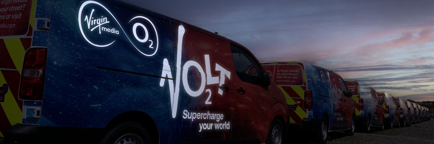
Aura Brand Solutions played a key role in implementing this rebrand, rolling it out across Virgin Media O2’s fleet, including their new electric vans. Our nationwide network of installers ensured the brand was represented consistently across the UK.
Key Takeaways:
- In mergers or acquisitions, thoughtful branding is essential to retain customer trust.
- Combining elements from both brands helps preserve their unique identities.
- Fleet branding can be a powerful way to signal change to your audience.
Thinking about how to handle branding after a merger or acquisition? Our experts are ready to guide you through the process - contact us today to discuss your needs.
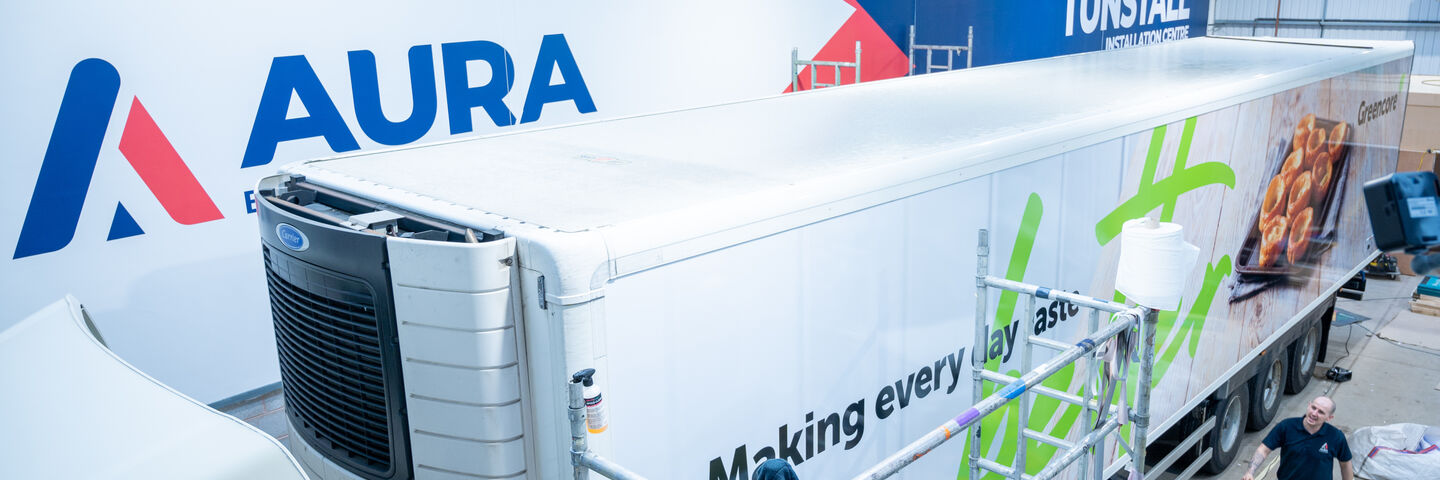
Greencore: B2B rebranding
Another project we had the pleasure of implementing through site signage, van and trailer fleets was the 2021 rebrand of nationwide convenience food producer, Greencore. They are different to the majority we’ve mentioned so far as they aren’t directly selling to consumers and solely deal in the business-to-business marketplace. This can affect brand design and brand positioning. In the case of Greencore, the rebrand was tailored to resonate with their business customers, emphasising qualities important in a B2B context, such as professionalism and trustworthiness.
A central focus of their rebrand was consistency and putting their employees at the core of their ideology, which they did by involving them in the process. After we’d created a selection of designs, Greencore employees voted by poll for their favourites, giving them some ownership over the brand and making them feel more connected with its future. Using photos of Greencore employees on their box vans added a humanising touch. These decisions improved employee engagement and turned them into true brand ambassadors – essential for a successful rebrand.
Key Takeaways:
- Involving employees in the rebrand process can enhance engagement and loyalty.
- In a B2B context, trust and professionalism are key brand attributes.
- Consistent branding across touchpoints builds credibility and trust
Is It Time to Rebrand?
What stands out the most to us is each brand’s loyalty to its beginnings. Incorporating historic brand elements is a key theme of many of these rebrands, and for good reason. In an era where trends constantly evolve and consumer preferences shift rapidly, maintaining a connection to a brand’s roots provides a sense of continuity and authenticity. These historic elements - whether it’s a classic logo, a signature colour palette, or a timeless tagline - serve as powerful symbols of a brand’s heritage. They remind customers of the brand’s long-standing values and its journey over time, fostering a sense of trust and familiarity whilst still moving with the times.
If you’re ready to start rethinking your brand, check out our rebrand checklist to guide you through the process.
But a rebrand isn’t always necessary! We can help you make the subtle changes needed to keep your brand looking sharp. At Aura Brand Solutions, we specialise in helping brands across fleet, rail, and architectural sectors make their mark. Whether you’re looking for a full rebrand or a few strategic updates, our experts are here to share their knowledge and ensure your brand looks its best across all platforms and environments.
Ready to take the next step? Contact us today and start your branding journey with confidence.