Railway 200: Celebrating 200 years of rail through the lens of branding
February 04, 2025
This year marks an extraordinary milestone in the history of rail transport: 200 years of the railway, which began when the Stockton and Darlington Railway made its first journey in September 1825. Railway 200 celebrates two centuries of innovation, engineering brilliance, and British cultural significance. But beyond the tracks, engines, and passengers, branding has played a crucial role in defining how railways connect with people and communities. From the earliest liveries to today's vibrant vinyl wraps, the evolution of rail branding offers a fascinating journey of its own.
Early rolling stock liveries: Function over form
The earliest rail liveries were a far cry from today’s bold and intricate designs. In the 19th century, functionality came before aesthetics. Rail companies used basic body colours, with pre-spaced text applied using the traditional brush-and-roll technique, often with Williams paint. These designs were simple, utilitarian, and uniform, reflecting the priorities of the time: durability and cost-effectiveness. Remarkably, the brush-and-roll method delivered results as good as, if not better than, early spraying techniques.
At this stage, branding was not a strategic priority. Instead, liveries served a practical purpose, identifying ownership and distinguishing rolling stock. Rail fleets were painted to withstand harsh weather conditions rather than to establish a brand identity or resonate with passengers.
In 1923, smaller railway companies were consolidated into the "Big Four" - Southern Railway, London North Eastern Railway, London Midland and Scottish Railway, and Great Western Railway. Each company painted its locomotives and rolling stock in distinctive but simple liveries that are still celebrated by rail enthusiasts today. For instance, Southern Railway's locomotives were often green, though the exact shade depended on the chief mechanical engineer of the time. Richard Maunsell, who led until 1927, preferred olive green, while Oliver Bulleid later adopted a bright malachite green. During World War II, a scarcity of paint led to locomotives being repainted black. Freight stock, on the other hand, was typically brown or grey.
In 1948, the "Big Four" were amalgamated into British Railways. Initially, a standard livery such as crimson and cream for coaches and black for locomotives was considered, but regional preferences prevailed. For example, the Western Region retained its brown and cream livery for coaches, while the Southern Region continued with green.
Towards the end of the 19th century, some operators such as London, Brighton and South Coast Railway (LB&SCR) which supplied the most direct routes from London to the South Coast seaside resorts saw the value in enhancing rolling stock presentation thanks to William Stroudley. William was one of the most famous English railway engineers of the nineteenth century, working principally for the London, Brighton and South Coast Railway (LB&SCR). They became renowned for their distinctive ‘Engine Green’ livery with carefully painted borders; As written in Murray’s Magazine in 1888, “No company, even the North-Western itself turns out smarter looking trains than the Brighton main line expresses.” They even used gold leaf to define the locomotives’ names.
The private franchise era
The privatisation of British Rail in 1948 ushered in a new era of rail branding. For the first time, rail companies had the freedom to further express their unique identities through rolling stock liveries, and the results were as varied as the rail companies themselves.
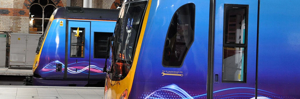
The 1960’s saw the end of steam engine manufacture and the introduction of the British Rail corporate blue identity. The double arrow symbol, designed to appear the same at high speed as stationary, is arguably one of the most recognised rail symbols and is still used today. Advances in rail technology in the 1970’s saw higher speed trains and big design developments ahead of the 1980’s Intercity redesigned which featured a sleek new executive livery cementing the corporate blue British Rail identity.
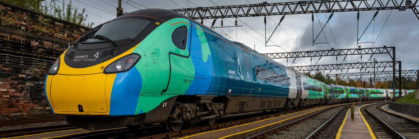
This period saw a proliferation of bold designs, with companies using bright colours, dynamic patterns, and striking logos to stand out. From the first eye-catching red and silver of Virgin Trains in 1997 to the nostalgic green and ivory of Great Western Railway, branding became a key way to connect with passengers.
Transport Designed’s list of the 10 best UK rail liveries since privatisation showcases just how creative rail branding has become. Designs such as the rainbow-themed Avanti West Coast Pride Train and East Coast’s “Flying Scotsman” livery demonstrate how branding evolved to tell stories, celebrate milestones, and engage with the public.
Key landmarks in rail branding
Over the past two centuries, rail branding has reflected broader societal and technological changes. Some key landmarks include:
- The introduction of logos: Early rail companies eventually adopted logos, which became visual shorthand for their identity. The iconic British Rail "double arrow" symbol, introduced in 1965, remains one of the most recognisable branding elements in the industry.
- The move to streamlined aesthetics: In the mid-20th century, liveries became sleeker, reflecting the streamlined designs of the trains themselves. Bright, modern colours began to replace the muted tones of earlier eras.
- Branding for events and campaigns: Themed liveries and graphics, such as special designs to celebrate anniversaries or promote campaigns, have become increasingly common. We’ve had the honour to do many of these for occasions such as Pride, Remembrance Day and the Queen’s Diamond Jubilee. These liveries share insights into operators’ values and engage passengers in new and exciting ways.
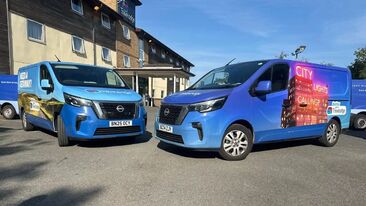
- Sustainability-led innovations: Today, branding extends beyond aesthetics to include sustainability. Many companies, like Aura, now use recyclable and non-PVC vinyl materials for liveries, reducing environmental impact while providing high-quality, durable designs. These advances align with the rail industry’s broader push towards greener practices.
Branding and sustainability
As rail operators strive to improve their environmental credentials, branding has evolved to meet these goals. One of the most exciting innovations in modern rail fleet branding is the use of recyclable, non-PVC vinyl for rolling stock liveries. These materials offer the same vibrant, high-definition results as traditional vinyl while being kinder to the planet. For an industry committed to sustainability, this development is a game-changer.
Not only do these sustainable materials reduce waste, but they also make it easier to update liveries for seasonal campaigns or temporary promotions, offering both flexibility and eco-consciousness.
Railway 200 is not just a celebration of engineering achievements but also a tribute to the power of branding in shaping the rail industry’s identity. From the humble beginnings of brush-and-roll painting to the vibrant, sustainable vinyl wraps of today, rail branding has travelled a long way. It reflects the changing values, aspirations, and innovations of the rail industry while connecting passengers to the rich heritage of rail travel.
As we look forward to the future of railways, branding will undoubtedly continue to play a key role in telling stories, inspiring journeys, and supporting the industry’s commitment to sustainability. Here’s to the next 200 years of railway and iconic fleet branding!